Renault Reveals New Brand Logo
Renault has given its iconic emblem a refresh to signify a new era for the brand.
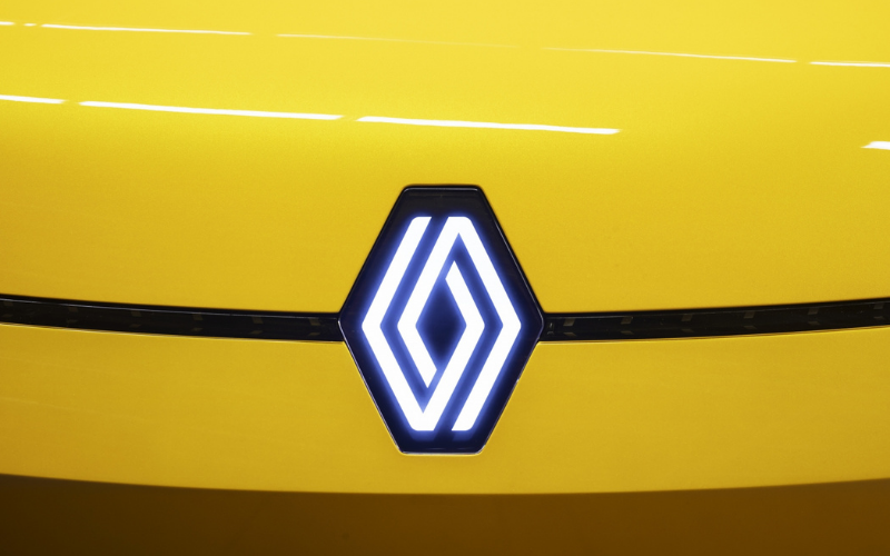
Unveiled at the Renaulution event, the new logo is simplistic yet eye-catching. The diamond shape, which has been synonymous with the brand since 1925, still remains but no typography will accompany it on the models to ensure a clean, decluttered look.
Gilles Vidal, Renault Design Director, said: “The diamond is one of the most recognised shapes in the world, and in the world of the automobile. It is a simple geometric shape, with a strong, powerful identity. The challenge was to renew this shape by giving it meaning, along with new, contemporary values to project the brand into the future.”
This is the 9th time the brand’s logo has been redesigned, and this newest version highlights a new era for Renault.

Gilles Vidal explains: "It is a balance between recognition of the brand's heritage and entering a new era, symbol of the future. The restyled diamond perfectly embodies the ‘New Wave’ era that Renault has entered.”
The new logo has already featured on the Renault 5 prototype and is set to be included on all Renault models by 2024.
Gilles Vidal concludes: "We have integrated it on the Renault 5 Prototype for the first time. It was for us a formidable testing ground. In view of the enthusiasm and the very positive feedback we received about the logo, we decided to launch it.”
To keep up to date with all the latest news from Renault, make sure to bookmark our news page.